
The importance of graphic design in fundraising

The Chell Perkins team recently met with graphic designer, Chris Harpa, to discuss the principles of good design. At Chell Perkins we support charities and churches with their fundraising requirements, both large and small, and a well-designed case statement is a fundamental part of a strong funding application. With more requests landing on their doorsteps than ever before, funders will be on the lookout for reasons to pass over an application; an illegible, hard-to-navigate or merely unattractive application will likely be dropped before a carefully designed one.
Chris kindly talked us through all the ways that charities can strengthen the design of case statements and cover pages for funding applications. The key points that Chris raised in our discussion were as follows:
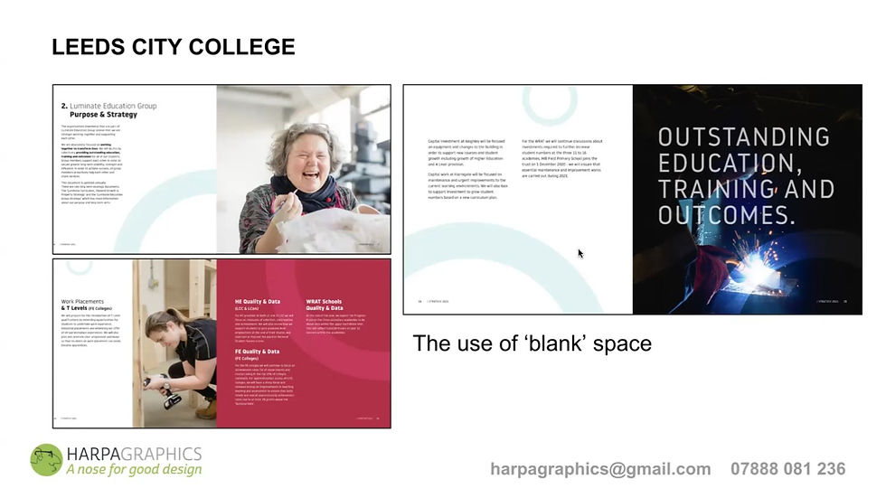
Space
Don’t be afraid of blank space! Text-heavy pages are hard to read and less impactful than a well-spaced layout in which the text is broken up with headings, images or pull-out quotes. Too much text can overwhelm your reader, while a balance helps the reader to stay engaged. A good design includes the necessary information to support your application in a clean, organised layout that feels effortless to navigate.
Colour
If your organisation hasn’t formulated brand guidelines yet (e.g. a colour scheme, logo, and chosen typeface) don’t worry! The best thing to do is ensure that the colours in your case statement complement each other. Use an online tool such as imageLR.com and pick out the colours in your logo or a key photograph you plan to include. Select the hex codes of your chosen colours (for instance, #f2322c is a bright red), then use these colours in your design – simply paste them into the colour picker in Canva or Google Docs – to highlight the elements that you want to stand out, such as headings or quotes. Using colour like this in your funding applications can help to strengthen your brand as a charity.

Photos and artwork
When used well, photos and illustrations will attract the reader’s attention and enhance your application. The key to this is only using high-quality visuals that support your message. When used poorly, for example through the use of busy background graphics, poor-resolution images or an excess of images, they can confuse the reader and lower the overall impact of your application. If you don’t have high-resolution photos, and sourcing alternatives is definitely not an option, consider using stock images (for example from Unsplash) – though remember to check the credit requirements.

Visual hierarchy
This simply means laying out the elements of your design so that they guide the reader’s eye to where it needs to look next. In practical terms this means using a cascading system of heading levels, with the main heading being in the largest type size and subsequent headings and body text getting gradually smaller. This leads the reader through your document in a logical system, and also allows the reader to scan through your application and easily find the information they are looking for.

Typography
One thing that is often overlooked in document design is the importance of the presentation of the text itself. Again, if your charity doesn’t have a chosen typeface for their brand, try to pick one that reflects the essence of the organisation, for example a crisp, rounded sans serif option for a more modern look, or an unfussy serif font for something more traditional. Keep it to a minimum: two is usually plenty; if you choose more than one, make sure they work together sympathetically; and crucially, make sure they are readable! Compare the effects of good and bad design choices below:

You’ll spot that the unifying theme running through all of these areas is consistency. When putting together any written outputs for your charity or organisation, consider the brand you are creating in the process. Once you’ve selected some key colours or typefaces for your charity, for example, try to keep them the same between projects.
We hope that Chris’s tips will not only improve the aesthetics of your funding applications, but that they will help you to build up an intentional presence and maintain a consistent identity that supporters and funders alike will recognise and resonate with.
If you’d like to contact Chris directly regarding matters of graphic design, you can email him here.


Comments